The 7 Best Modern Graphic Novel Series for 2017
By BrendanGraphic novels are long-form storytelling by way of merging art and words. They differ from comic books in that they are generally longer and not planned to be perpetual - i.e. they have an overall story to tell; they're working towards an ending from the beginning. It's a relatively new medium, as most consider Will Eisner's 1978 A Contract with God to be the inaugural release. I had the pleasure of reading that book recently, and it's clear even today that Eisner was a visionary as well as a master craftsman. And in fact it's his name that's used to honor the top contributions to the field each year with the industry's highest form of recognition: the Eisner Awards.
In the decades since we've seen classics get converted into movies, TV shows, and games. The likes of Watchmen, V for Vendetta, Wanted, The Walking Dead, and Preacher have all graced our screens. The late 90's and early 2000's saw some modern geniuses rise to prominence: the likes of Warren Ellis (Transmetropolitan, Planetary) and Brian K. Vaughn (Y: The Last Man, Ex Machina) continued moving the genre forward.
And inexorably, we keep moving. This post is concerned with recent additions - only the last couple years - and specifically highlighting the best of the best. There were some close calls and a lot of others I'd love to talk about. Prophet has amazing artwork that blew me away when I perused the first volume, but I found its writing amateurish. Lazarus nails the writing, but it's impossible to tell what's going on in the frenzied artwork. Rather than digging into what those could have done better, I limited myself to only highlighting those that excel in both parts of the medium.
These are the ongoing series that succeeded in the synthesis of words with visuals. All of them are still releasing new issues. These are my top 7 graphic novel series for 2017, in the order that you should run out and buy them.
Saga
Writing by Brian K. Vaughn, Art by Fiona Staples
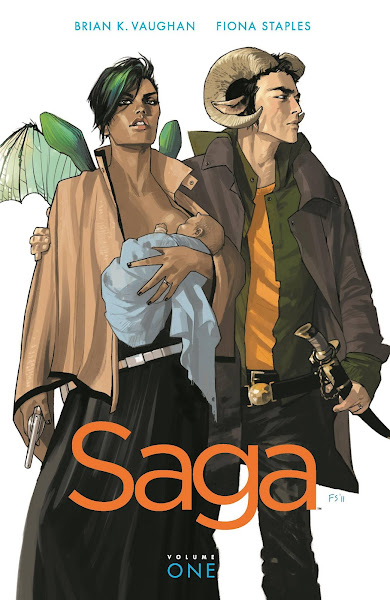
Volume 1 on Amazon
Saga is the gold standard nowadays. It's referenced on social media, in TV shows, all over. One of its characters is a cat that can only say the word "Lying," and then, only says it if a lie was actually told. Lying Cat has become a semi-famous meme: it can be found on t-shirts and making cameos everywhere, even by those who don't know where it originated.
Beyond the popularity, Saga is also notable for the artwork, which is refreshingly bold. The colors pop in over-saturated pastels. Bright pinks and teals and yellows dominate. The adventure explodes into life, and I love it.
The story is told from the perspective of a baby, which is unique and surprisingly effective. It feels like a space opera Romeo and Juliet, but there are still some nuances within that. Saga manages to mix adventure and drama and romance and comedy into something magical, giving it that Star Wars quality everyone strives for.
If you have to start somewhere, start with Saga.
Low
Writing by Rick Remender, Art by Greg Tocchini
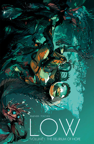
Volume 1 on Amazon
The first volume of Low was a book I bought based solely on the premise: in the far future the sun has expanded, driving humanity beneath the ocean waves to escape its deadly radiation. Thousands of years pass while human culture, technology, even biology change while they wait for a response from probes sent to find another planet with a habitable surface somewhere.
Despite mostly taking place underwater, the artwork is very warm: there's a reddish-orange tone to most of the sets and backgrounds. It looks a little sketched and the lines aren't always clean, almost as if being viewed through water. But where it really excels is in the frequent large spreads: there are a lot of full-page and multi-page pieces, and they're filled with tiny details.
The surprising thing is that while the setting drives the action, it is not the reason Low continually impresses me: it's the characters and their journeys. There's an extreme amount of loss and pain here, showing the worst of what humanity is capable of when put into life or death situations. But throughout all of it there's also a persistent thread of hope. And that hope helps the characters keep moving forward.
Low takes a totally fantastic world and puts very real people smack in the middle of it.
Revival
Writing by Tim Seeley, Art by Mike Norton
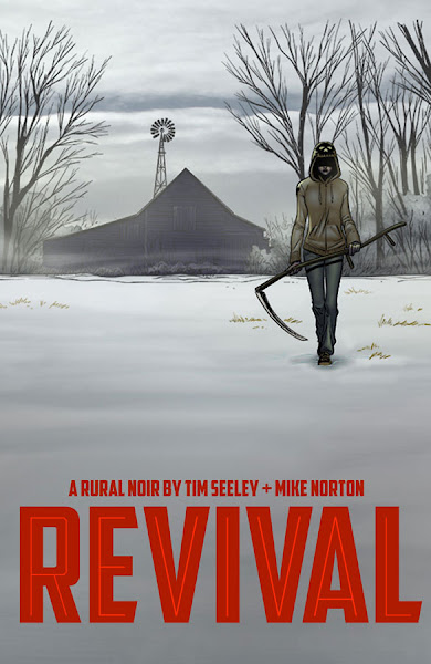
Volume 1 on Amazon
The dead have come back to life! In a single small, rural town. But they're not zombies. If this sounds familiar, that's because there's a TV series called The Returned that has a very similar premise, and has been remade and adapted several times. But where The Returned feels derivative, Revival is refreshing.
The genre is one the creators call "rural noir" and it shows a lot of promise. Specifically, they're asking the question: how do average people cut off from the rest of the world behave when confronted with both the supernatural and the mundane? It focuses on families and relationships, as well as power struggles within the tight-knit community. It's powerful and intimate at the same time.
The art is very clear, concise even. Character outlines are thicker than usual, so you can easily separate them from their surroundings. This clarity makes the horrific events happening all the more impactful.
If we have to compare it to a TV show, Revival actually feels much closer to The Leftovers, which is high praise from me. In both series I'm not sure we'll ever find out what actually happened, but that matters far less than what the people in these worlds go through.
Wayward
Writing by Jim Zubkavich, Art by Steven Cummings and Tamra Bonvillain
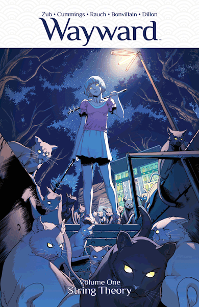
Volume 1 on Amazon
Imagine that Japanese mythology is real, and a bunch of teenagers turn out to have super powers and have to fight demons and monsters in the street. Wayward is just that, and it's chalk full of tropes. But I can't help liking it.
First, seeing the research done into the mythos is incredible: each volume contains a large prose section explaining the history of each of the legends. It's great background if you're interested, but you can also safely skip it if you're uninterested.
There's a lot of action: this is a modern, more grown up Ninja Turtles taking place in Tokyo, so there's plenty of punches and kicks thrown right beside swords and spells. But the art keeps it all in check: energy strands are bright and movements are precise. In less skilled hands all the explosions would be a hindrance to the storytelling, but instead we get some epic battles worth re-reading.
This is a coming-of-age story about superheroes: it's fun, and probably less serious than most of the other entries on this list. I keep looking forward to it as a nice diversion, and because the plot keeps thickening with every issue.
Trees
Writing by Warren Ellis, Art by Jason Howard
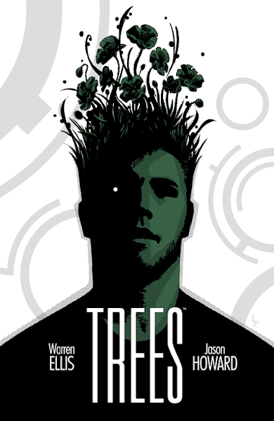
Volume 1 on Amazon
Trees is...
Well, it's about aliens.
But they don't talk to us or interact with us in anyway. They're just there. Like the TV show Colony, or the book Neon Green.
Ok, it's not really about aliens.
It's about us. And our ability to adapt.
The art is hurried - not always clear, but consistently emotional. Silence is used to great effect: it's not uncommon to see 4 to 6 pages in a row without a single speech bubble. This is the epitome of show, don't tell. It's brave and masterful.
Trees isn't quick to explain the aliens or why the came to Earth. It uses them instead as a mirror to tell us about ourselves.
Injection
Writing by Warren Ellis, Art by Jordie Bellaire and Declan Shalvey
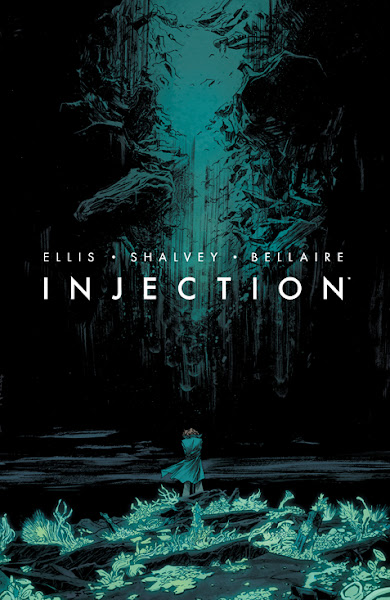
Volume 1 on Amazon
Injection begins with these words:
There's not much left of Maria.
The wind from tomorrow is scouring her away.
The talons of the old world are reaching up out of the dirt for her ankles.
She can barely remember what hope and peace felt like.
She dreams of those infinite childhood Augusts when she didn't know anything and nothing was coming, and wakes up with cold in her bones.
That was more than enough to hook me immediately. I don't want to say much more, because part of the experience of Injection is discovering what's happening and why. Suffice it to say that a group of experts is gathered to combat some bizarre phenomenon. It's roughly comparable to something like Torchwood, but there's a lot of depth beneath the surface.
The art is simpler than normal here, but it's still effective. Characters are a bit desaturated and plain, while backgrounds are often just a solid unadorned color, but it allows for particular and purposeful emphasis. At one point in the second volume the background shifts through a rainbow as the tone of the scene changes. It's visually striking, and powerful.
Injection is fundamentally about facing the consequences of our prior actions. It chooses its visuals and words deliberately, to great effect.
The Autumnlands
Writing by Kurt Busiek, Art by Benjamin Dewey
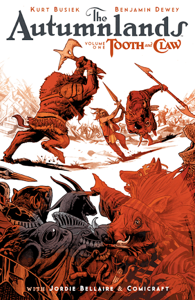
Volume 1 on Amazon
Animals have the ability to talk, and they've created a civilization up to the level of something approximating our own feudal/medieval time period. It's fantasy complete with spells and wizards and barbarians.
Normally I would find this boring. It seems like you could predict everything that's going to happen just based on the genre and all the cliches built up over time. But The Autumnlands surprises in the best ways. The art is subdued and somber, until magic explodes onto the page. I love the way spells look here: they're bright and violent.
The story goes down dark, dark paths. There's a particularly forceful event early on that went the opposite way than I expected it to. That moment hooked me.
The Autumnlands is a tragedy about the trappings of power, the loss of innocence, and trying to maintain friendships through hard times. It doesn't matter that the characters are animals: they're people in all the ways that matter.